Designing an identity where anyone, anywhere can see themselves as a learner
Objective
As Coursera grows in serving 75m+ learners across the globe through new products, business, and relationships, our company needed to reposition our brand strategy and identity to reflect the growing needs of our learners. This required a new visual identity to reflect the established and trusted global brand we were becoming.
Challenge
Design a visual brand identity functional across the company from sales, product, marketing, and content. With an inherited new logo from an external agency, our internal brand team was tasked to design an extensive brand identity and foundation with its kit of parts that conveys learning and trust for our learners.
Solution
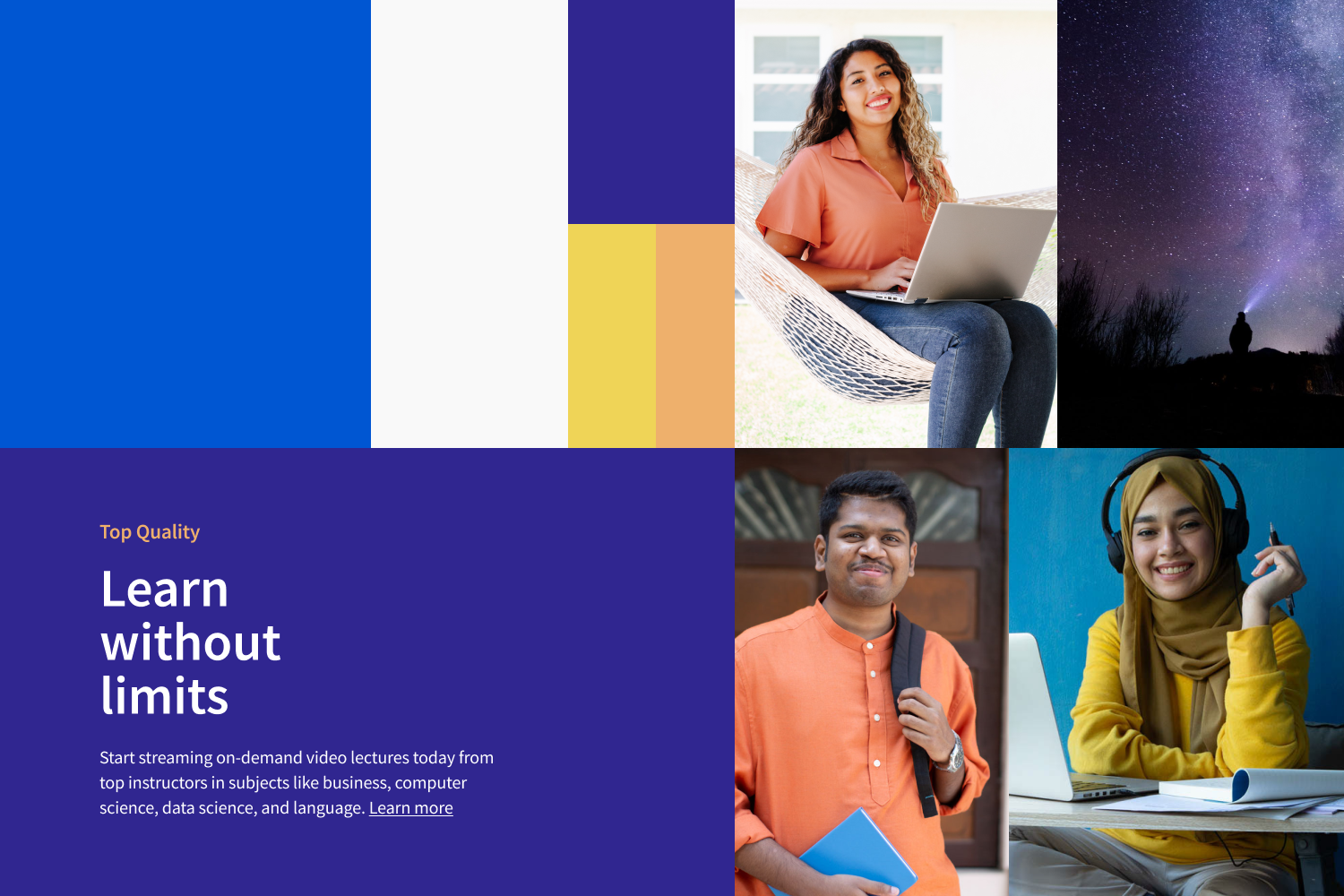
Learners are at the center of all of our experiences. This was our compass for developing an art direction that would always focus on honoring their stories in authentic and engaging ways. We designed compositional guides centering them as our heroes in all of our visuals. We established a bold and uplifting new color palette. Our new system was created in close collaboration from Product to Marketing teams to ensure all our materials were accessible, brand-aligned, and met the aspirations of the company.
(brand design foundation)
(compositions & illustrations)
Design
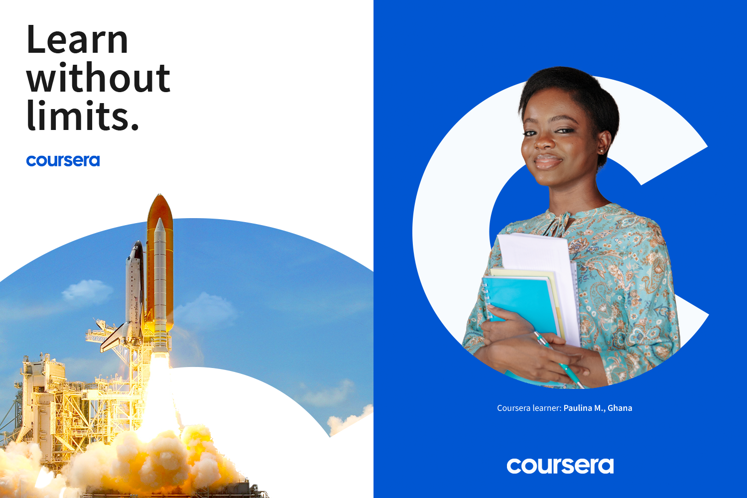
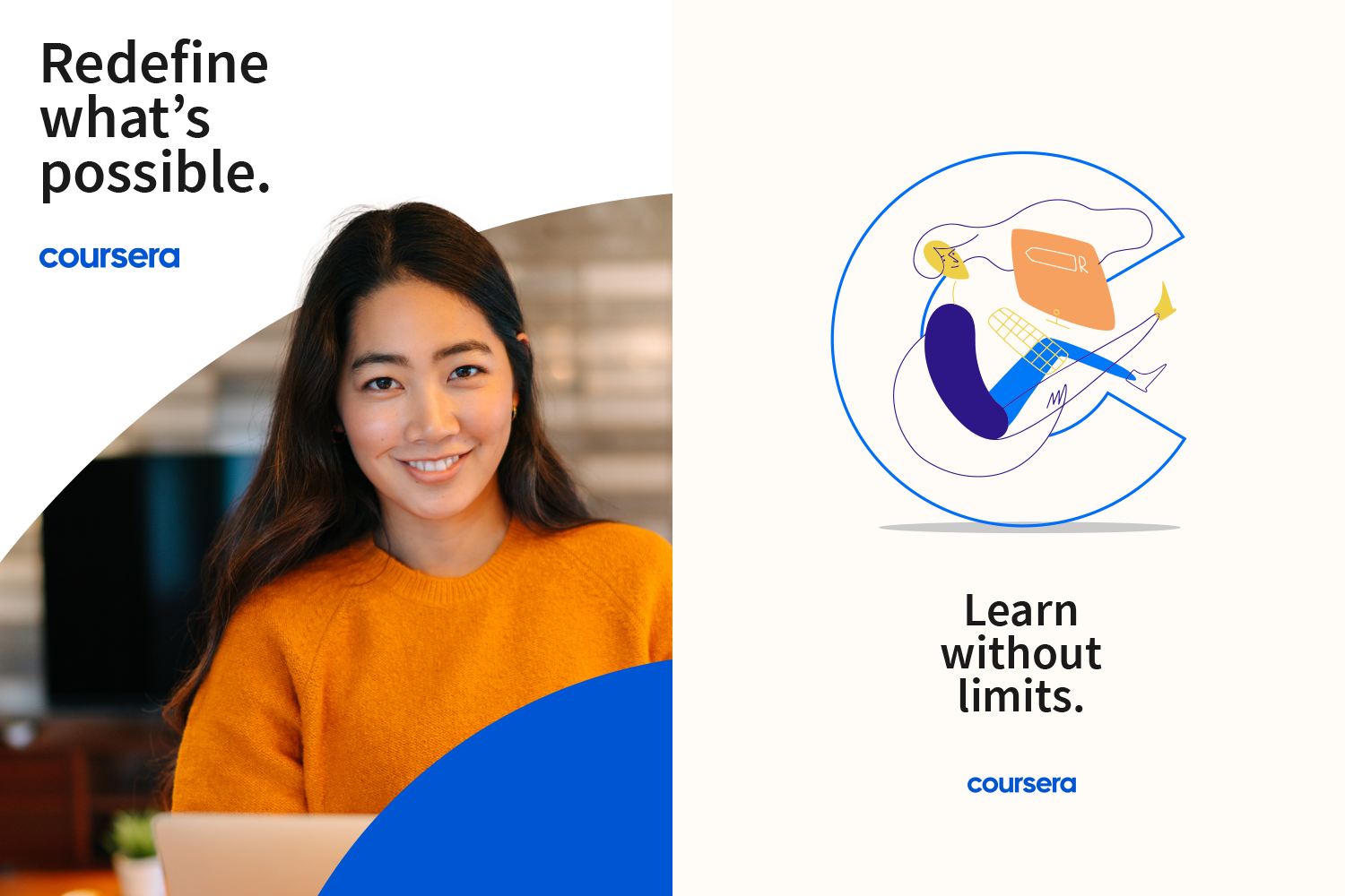
At Coursera, we believe learning is a source for human progress. As part of this mission, we created design devices to reflect this belief and highlight learners and their paths through our platform. We created multiple compositional structures to uplift our partners by featuring them within our new C symbol. We focused our art direction on clean, aspirational photography learners and audiences could see themselves in. All the while creating guides and templates for all of our design elements from photography to our graphical elements for scaling through vendors and creative partners.
We selected bold colors learners felt familiar with in the technology industry while including accents to bring warmth to our visuals for a sense of humanity, hope, and optimism. In every moment of learning, there is an opportunity for transformation. Our designs reflect the dynamic movement and path each learner has during their experience with education. We used the letterform as a window where we can showcase learning content, categories, and course materials. We needed a flexible system across our compositions as our brand often takes the shape and form of our content partners via brand colors, logos, and photos.
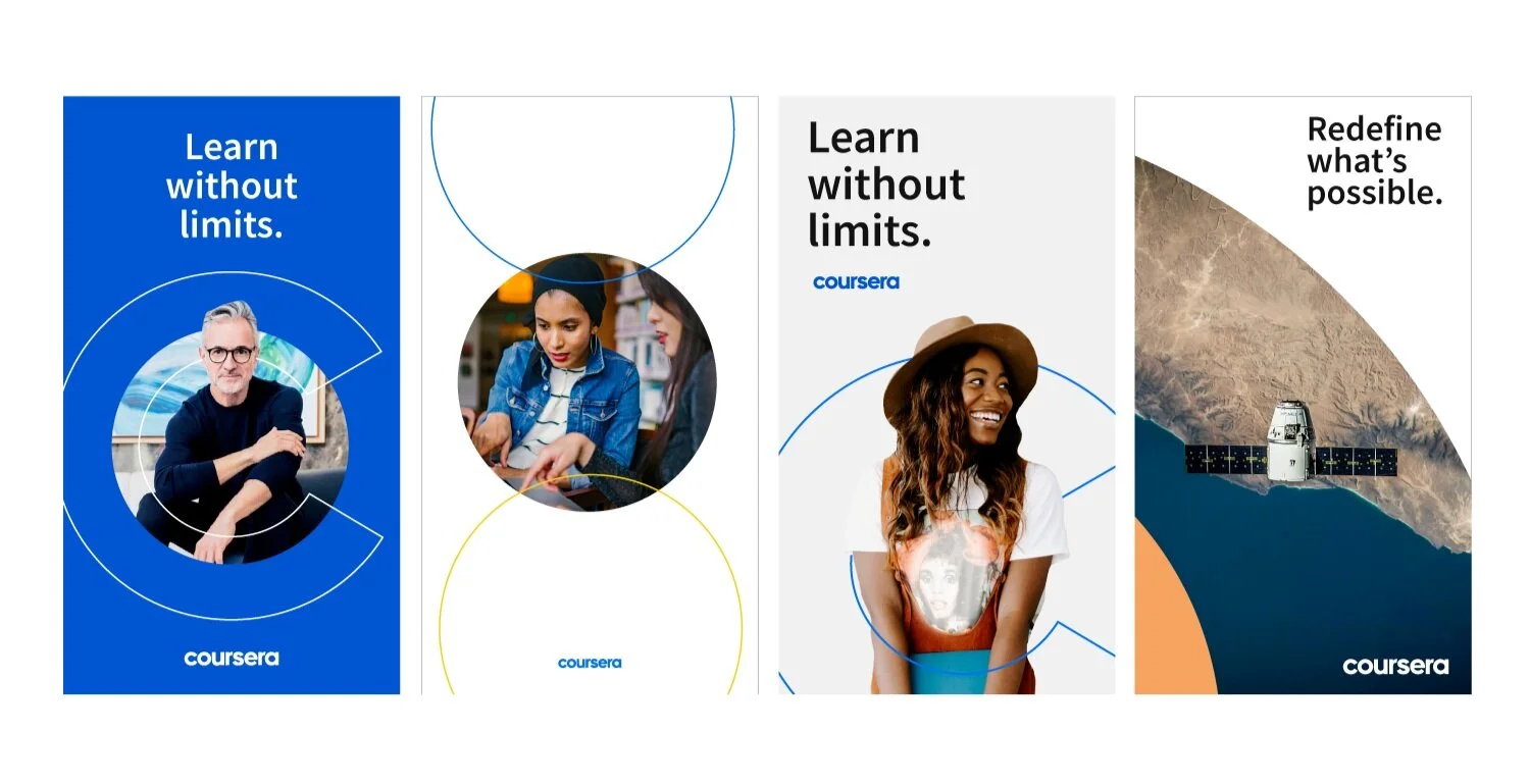
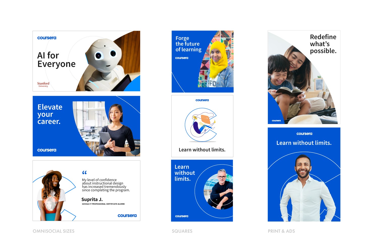
(master compositional elements used across social story formats)
(course considerations, learner focus, marketing & advertising)
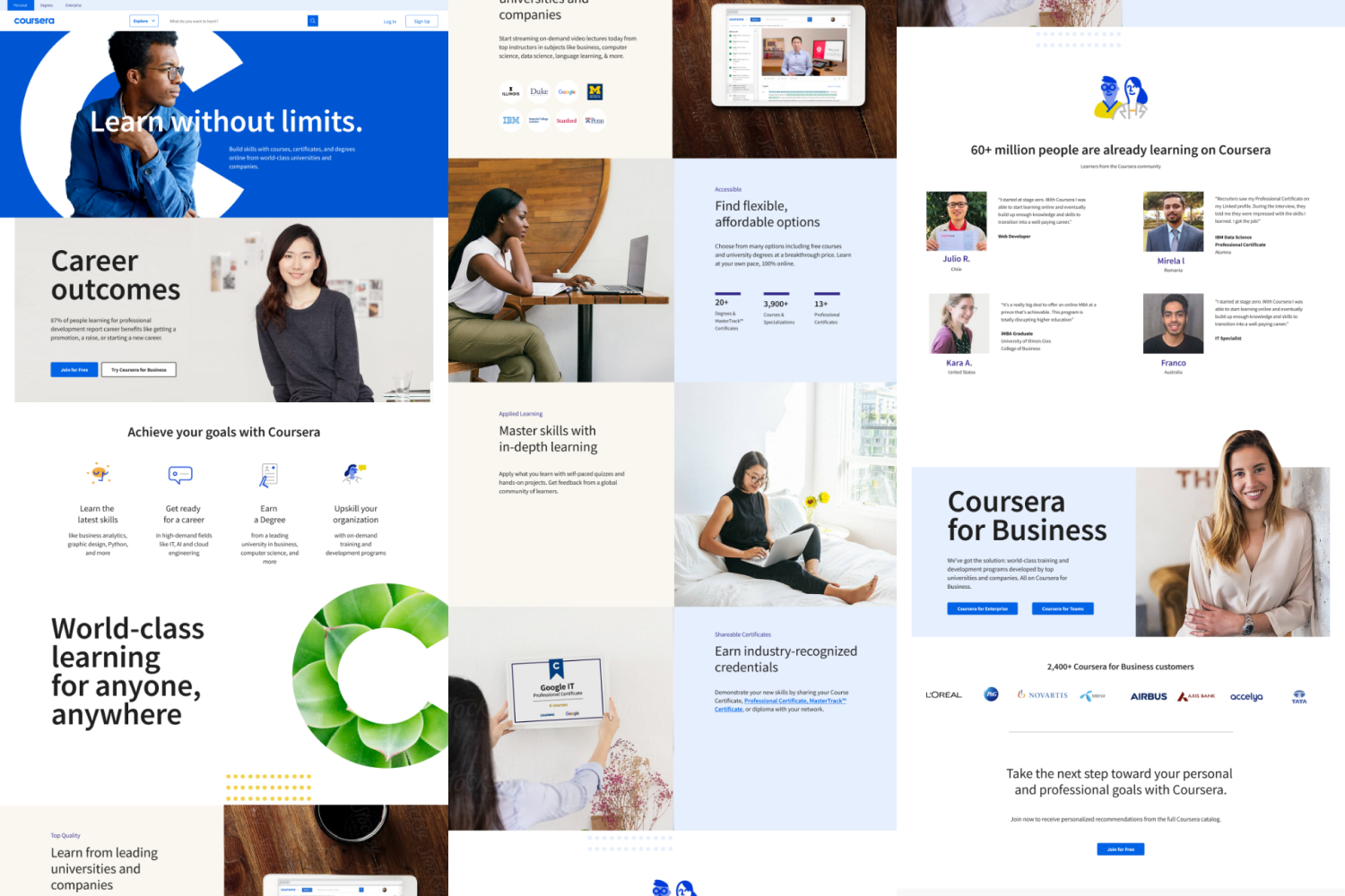
(logged-out homepage design)
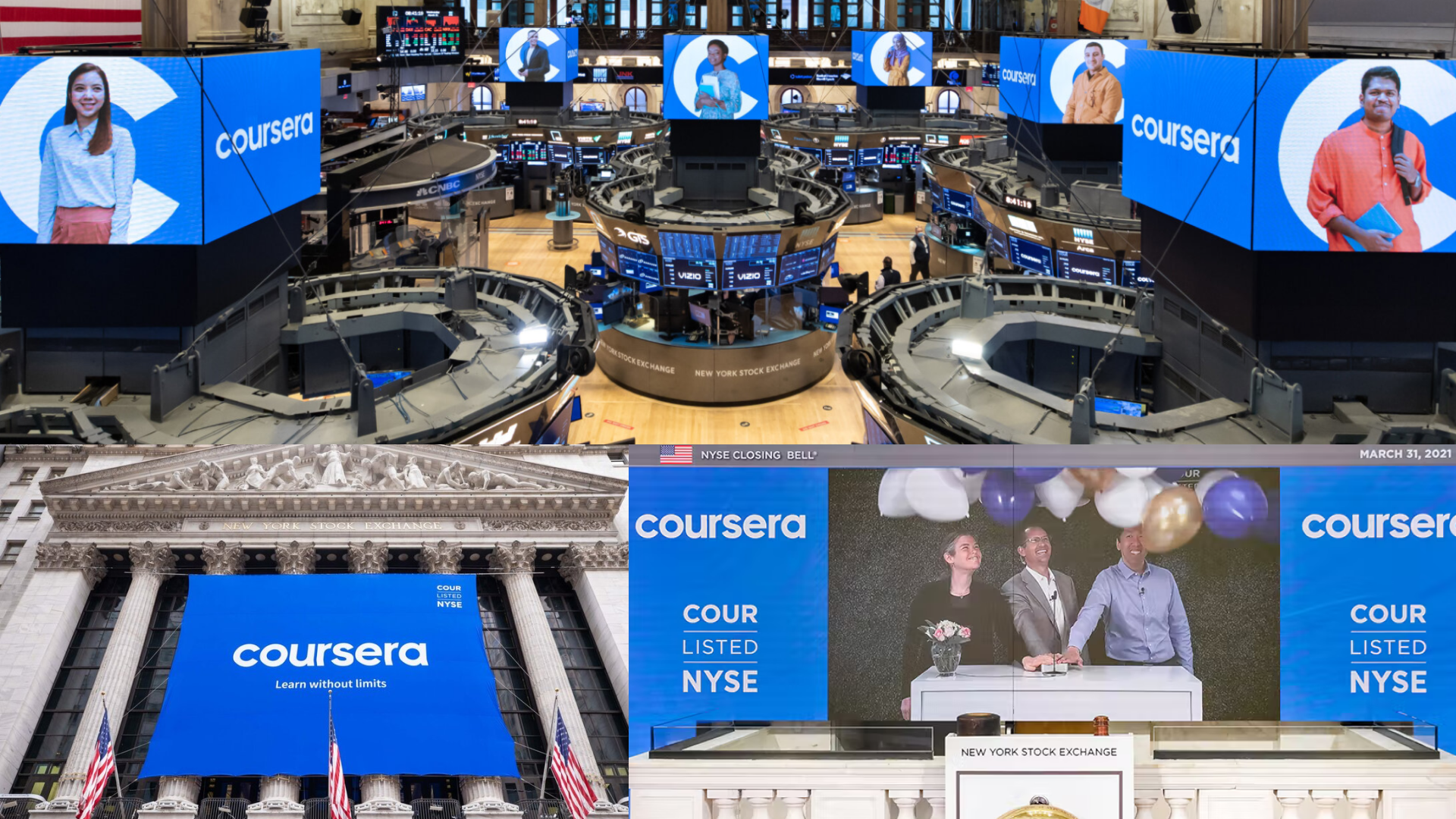
(Coursera IPO campaign: NYSE)
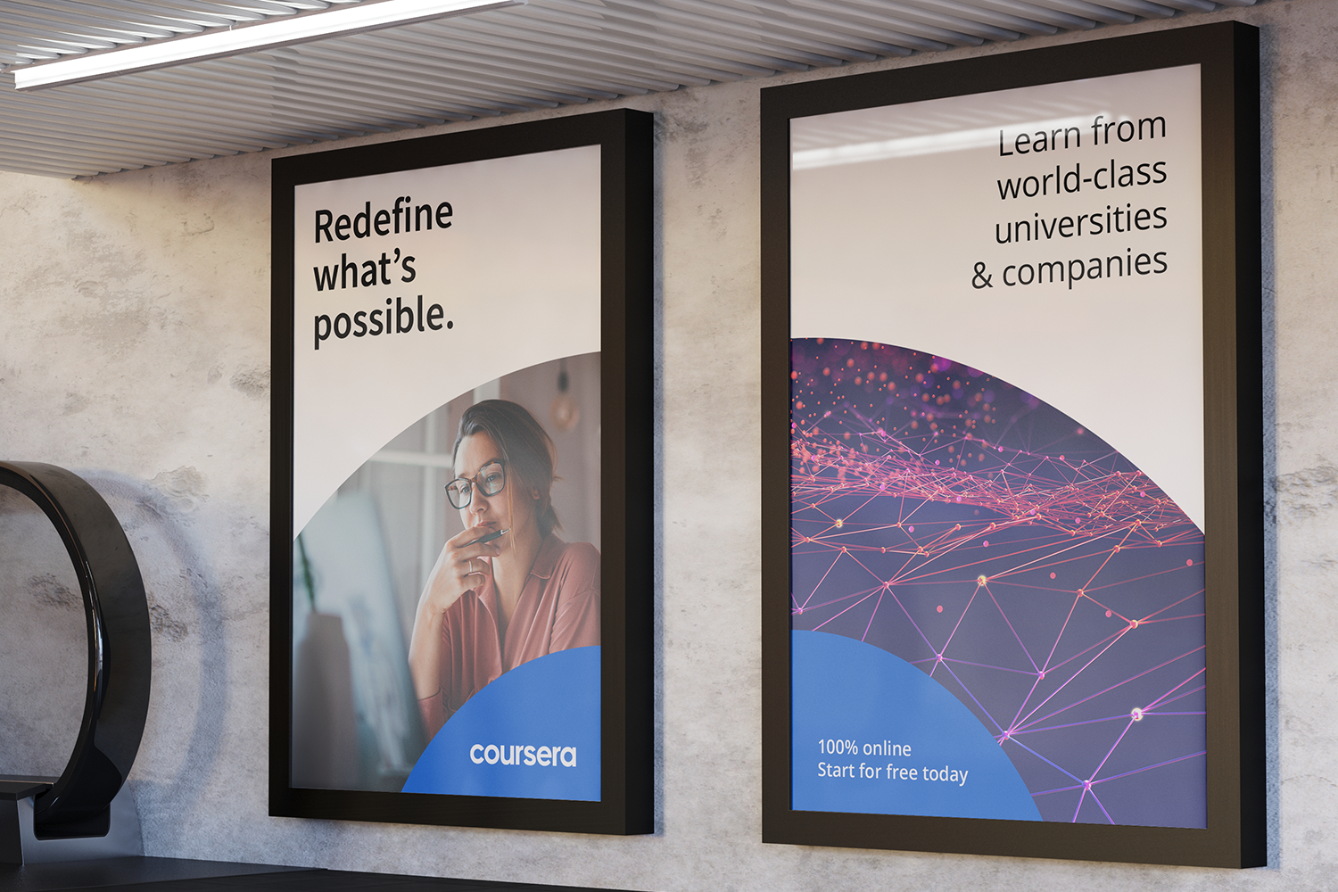
(print/advertising)
Head of Brand Creative: Stephanie Hale
Creative Director: Carrie Ammermann
Art Direction/Lead Designer: Tousue Vang
Designers: Sarah Lynch, Myray Reames, Bianca Weber, Juliana Nagan
Web Development: Patricia Anet, Kelvin Nguyen
Senior Brand Manager, Strategist: Emily Keller-Logan
Copywriters: Christopher Watkins
Creative Agency: Wolff Olins