Help homeowners see the possibilities of their homes, and make them a reality.
Objective
With HOVER’s rapid growth and expansion into the insurance and consumer marketplace, our brand team had a specific opportunity to position ourselves as the go-to place for homeowners when making any improvements to their home. Our goal is to establish an identity that can scale across the company while setting the tonal expression for HOVER.
Challenge
The voice of HOVER was disparate and inconsistent from team to team. There was no clear way to speak to our customers, share our products, and have alignment in how we approach conversations. The visual identity was different from Product to Marketing, and our sales teams were often times left creating their own materials. Existing customers were becoming disconnected and intimidated from differing messages about what the product helped them accomplish. New customers feared our product was too “tech-y” and wouldn’t fit their workstreams.
Solution
We conducted interviews with customers, executives, and team members on pain points and opportunities. We created a strategy and plan to make our brand more approachable and centered around the thread that ties all of us together, homeowners. Our approach was simple, speak in a way one’s neighbor would speak to them. Be knowledgeable, simple, all while earning trust as a reliable expert in the industry. With this, we began crafting the foundation of our brand which consisted of a Writing Guide, Visual Identity, and compositions to help support teams across the entire company.
(brand design foundation)

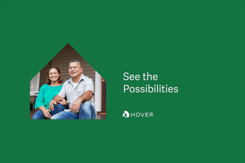
(3D houses for capture process and instructional content)
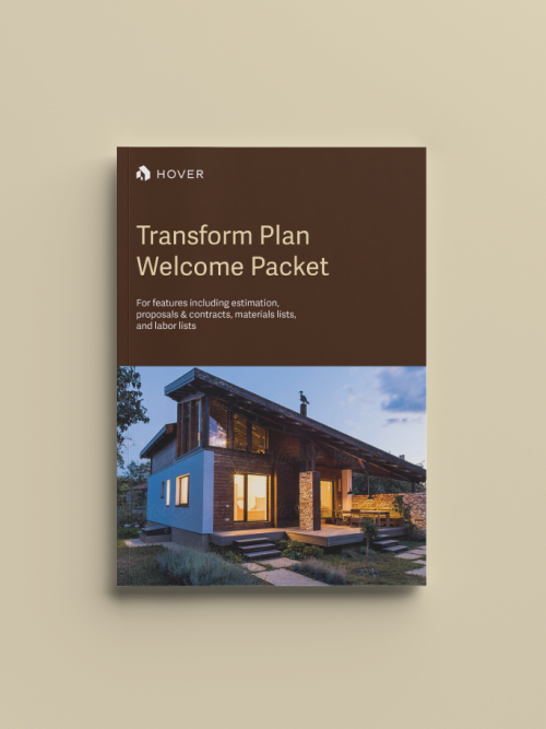
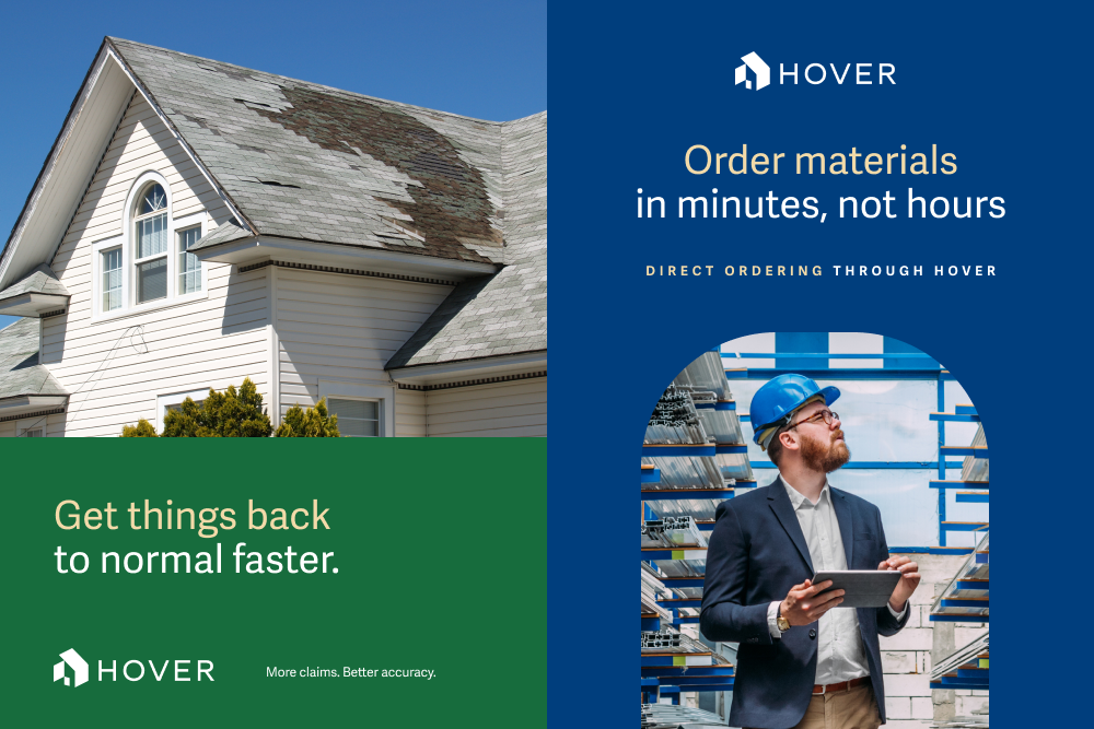
(ads, pdfs, and booklet templates)
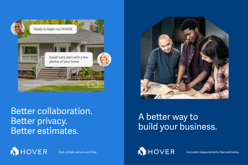
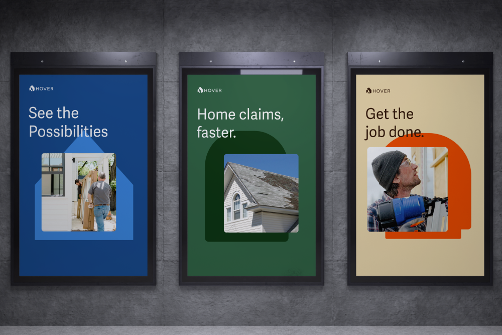
(messaging, composition, ads)
Design
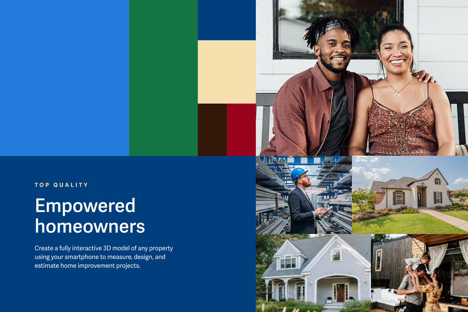
Our design foundation needed to influence every part of the company, from Marketing to Product and all uses internally. The color palette was selected to feel grounded in the tones we commonly see in homes and neighborhoods in America. The hues of a clear sky, a green yard, and soft accents of a roof or front door.
Our design devices include simple and memorable shapes within American architecture and houses. Windows, Doors, and Roofs. Each shape becomes an entry way and an invitation to approach the subject matter inside, whether that’s a homeowner, or a contractor restoring your home after a storm, updating a roof, or simply wanting to see what’s possible with your windows. This became the catalyst for all design structures in our brand kit.
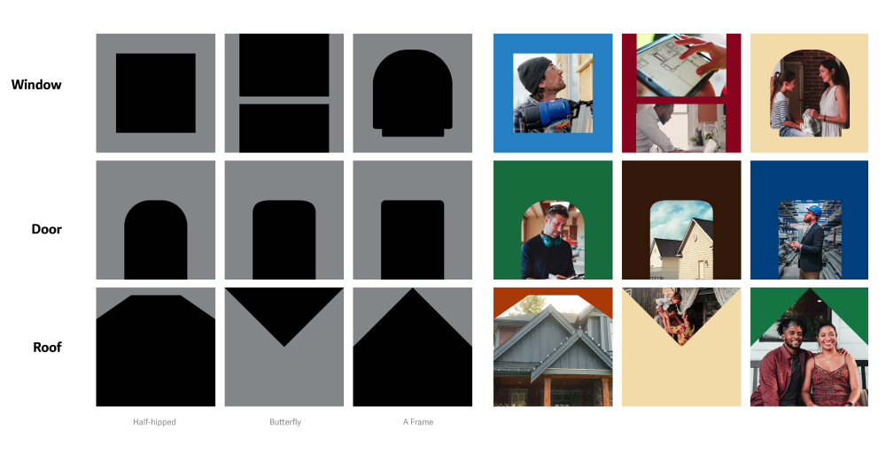
(shape system for image devices)
(insurance & distributor messaging ads)
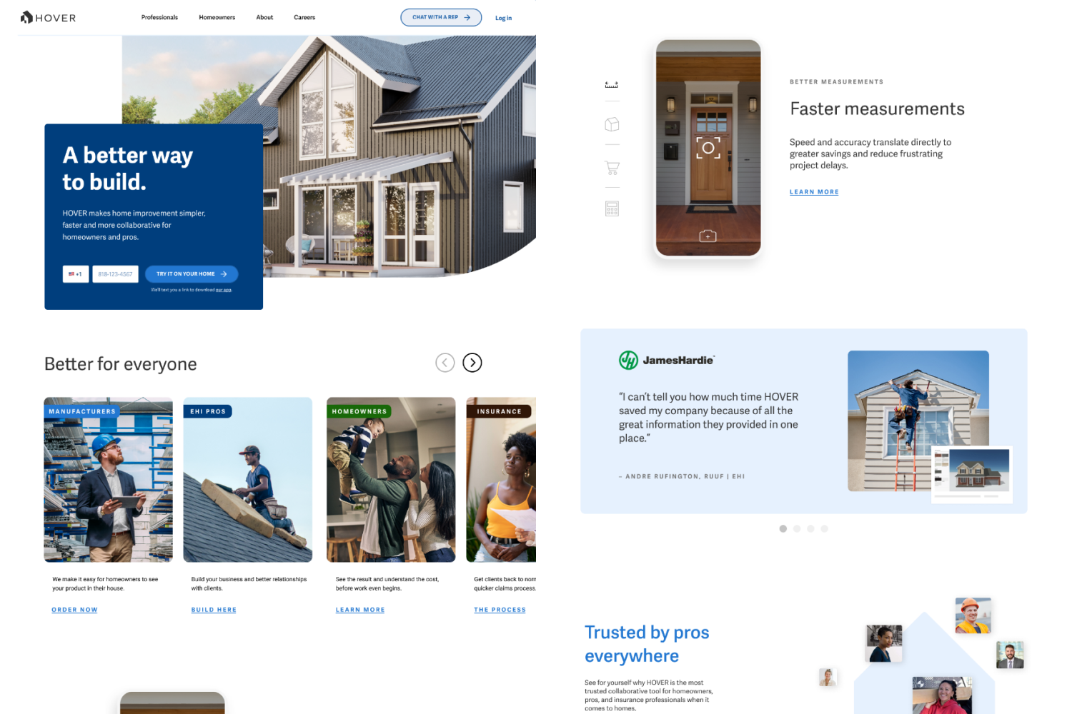
(logged-out homepage design)
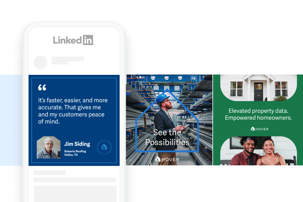
(example social media)
(example copy & art placement)
Head of Marketing: Francie Strong
Brand Lead: Alex Capasso
Art Direction/Lead Designer: Tousue Vang
Designers: Bianca Weber, Iggy Igner, Rita Gunderson
Product Marketing Manager: Martina Rogers
Copywriters: Jeff Gonick, Mandie Caroll, Elaine Sheng
Chief Operating Officer: Matt Lewis